Mario-
The feedback interface in Mario is very simplistic, it clearly shows the player:
what score they are on,
how much time they have left in the level,
how many lives they have left,
how many coins they have,
how many star coins they have,
and how many points they just received.

This allows players to see all relevant information without it getting in the way.
Halo Reach-
The feedback interface in Halo reach is very complicated, it shows a lot of information for the player, in the rush of an online game this information can be easily missed. This information includes:
the amount of ammo with the player's weapon,
the amount of ammo in the player's magazine,
the player's health,
the player's shields,
the amount of grenades the player has,
the current objectives,
the opponents name,
the crosshairs of where the player's weapon is aiming,
if there is a weapon that the player can pick up,
the player's current weapon,
the player's secondary weapon,
the time remaining in a game,
the current game type,
the current score,
the kill feed
the player's amour ability
the radar showing moving enemies and friendlies,
the range of the radar,
the player's current location,
deceased markers,
ally markers.

This is a lot of information to consider in the middle of an online game, but the player does not need to consider it all the time allowing them to focus on the important stuff.
Mario Kart-
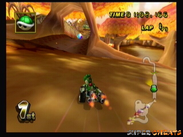
The feedback interface on Mario kart is simple and doesn't distract the player form the gameplay, allowing the player to see important information when they want without crashing. This includes:
the player's item,
the player's current lap time,
the lap the player is on,
the map of the race track,
the player's current position.

This information is placed around the outside so it doesn't distract the player making them able to fully focus on the game.
No comments:
Post a Comment